TWO SIDED PLARFORM | B2B | B2C | LIVE PRODUCT
VOW - Hotel Booking, Reimagined.

OVERVIEW
A hotel booking app for young couples with flexible stays - from a few hours to overnight. I joined after the app went live and worked on redesigning the experience and building new features.
TL;DR
THE SITUATION
VOW was already live. I came in to fix what wasn't working and add features users and owners were asking for.
WHAT I WORKED ON
Hotel detail page, payment flow, slot booking, AI concierge, owner tools, admin panel - across 3 surfaces.
HOW I APPROACHED IT
Every change came from real feedback - users, hotel owners, and the client.
CONTEXT
A live app that needed a second look
VOW lets young couples book hotel rooms by the hour - 4 hours, 10 hours, or overnight. A lot of the properties are actually furnished apartments rented out like hotels, with no proper reception area. The app was already live when I joined. My job was to figure out what wasn't working, fix it through several rounds of iteration, and build new features the product needed.
THE PROBLEM
Too many calls, too many gaps
The client was getting a lot of support calls from users who couldn't figure out how to book. Hotel owners were also frustrated - they didn't have the tools they needed to run things smoothly. When I looked at the app, the problems were pretty obvious.
User-side
Booking flow was confusing. Book Now button was buried at the bottom. No way to save or share rooms. Payment summary was hard to read.
Owner-side
No way to handle guests who show up late. No way to see how busy the month looks. Receptionists had no useful tools.
HOTEL DETAILS PAGE
The Book Now button was the last thing on the page
When the client told me about the support calls, I opened the app to see what was going on. The hotel detail page was the first thing I looked at.
WHAT I FOUND
Users had to scroll through the entire page just to reach the Book Now button - it was sitting at the very bottom. There was no favourite button, no way to share a room, and the photos were just one static image with no way to browse.
WHAT I DID
Made the Book Now button fixed to the bottom of the screen so it's always reachable. Added a favourite button next to it so users can save rooms they like. Added a share button at the top - couples often send options to each other before deciding. Converted the photo into a scrollable gallery so users can actually browse the room. Each room also has tags like couple-friendly or romantic to help users pick quickly, and some rooms show age eligibility since bookings are allowed from age 17. I also added an optional age calculator - just a helper, not a gate. All room types are shown in a horizontal scroll with the most commonly picked room selected by default.

Fixed Book Now, share + favorite

Optional eligibility check
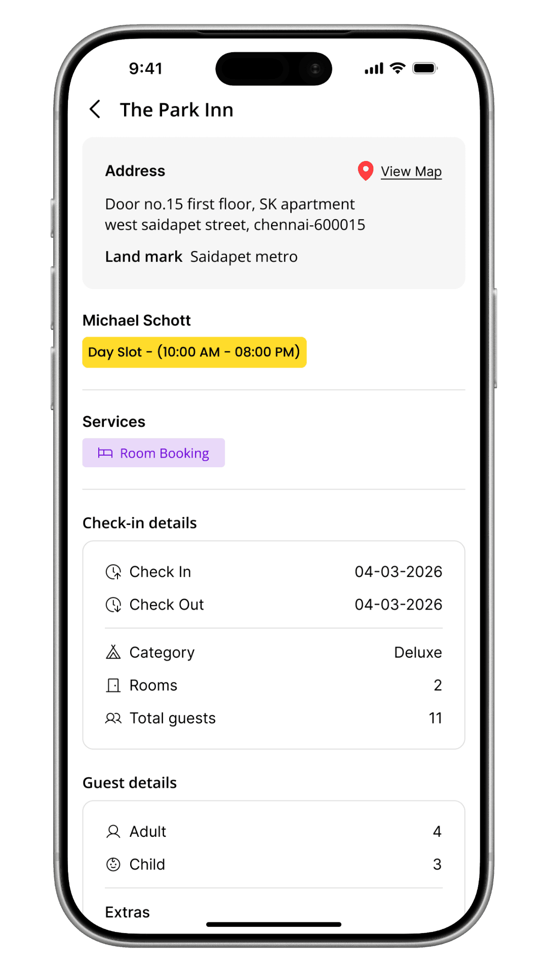
PAYMENT FLOW
Hard to trust what you can't read clearly
The payment page had all the right information - it was just thrown together with no real structure. Before someone pays, they need to feel like they know exactly what they're paying for.
WHAT I FOUND
Check-in details, price, and guest info were all mixed together. There was no clear way to scan the page and feel confident before tapping confirm.
WHAT I DID
Split the page into three clear sections - check-in details, price breakdown, and guest details - so users can read through it quickly and know what they're agreeing to. The client also asked for two new features: a half-payment option where users pay 50% now and the rest at check-in (the receptionist scans a QR code to complete it), and an optional children toggle in guest selection - off by default, there when needed. We also added a Cashfree fallback as a team - if Razorpay fails, users can switch and finish the booking instead of starting over.

Count + children toggle

50% now, rest at check-in via QR

Payment options

Shown when Razorpay fails
BOOKING HISTORY · RECEPTION LOCATION
Users didn't know where to go after booking
Because a lot of VOW properties are apartments, there's no obvious reception. Users were calling the client after booking just to ask where to check in. It was one of the biggest reasons for support calls.
WHAT I DID
Added the reception location directly on the booking card in the history page. Bookings are split into three tabs - upcoming, completed, and cancelled. The location shows on the card in the upcoming tab, right where users look after they've booked. Tapping the card opens the full details.

Reception location on the card
Full details on tap
SLOT BOOKING
Booking by hours, not nights
The slot model was already in place. My job was to make it easy to use - mainly making sure users always knew what time they needed to check in and check out without doing any math.
WHAT I DID
As soon as a user picks a slot, the screen shows the actual check-in and check-out times in plain language - something like "Arrive by 2 PM, leave by 6 PM." No guessing, no calculating.

Date selection

Slot cards
AI CONCIERGE
Finding a room by just describing what you want
The client wanted users to be able to find and book hotels through a conversation instead of navigating filters. I designed both the voice and chat interfaces from scratch. The concierge shows the best matches based on what the user describes - it doesn't book on their behalf. Once they pick a room, it takes them into the normal booking flow.
THE TRICKY PART
Voice interfaces break easily. I had to think about what happens when the app mishears something, loses connection, or gets no response at all. Every one of those situations needed a way out that didn't feel broken.

Ask your querries

Just say it out loud
OWNER APP
I also worked on two things in the hotel owner app. The first was a check-in flow for handling late guests - when someone doesn't show up on time, the receptionist can mark them absent with one tap. The guest gets a notification straight away and a pop-up asking if they're still coming. They can confirm, cancel, or give a new arrival time. The receptionist sees the update in real time. No phone calls needed on either side.
The second was a calendar page that shows how many bookings are on each day for the month, broken down by slot type. Hotel owners asked for this - they just wanted a simple way to plan ahead. It's read-only, nothing more than that.
ADMIN PANEL
The admin panel is used by the VOW team internally. I worked on three specific areas - adding new payment methods (with a confirmation step before anything goes live), switching the SMS provider used to send guest notifications, and a notification panel for writing and editing message templates. None of these are visible to users, but they affect everything that runs in the background. I kept the focus on making each one clear and hard to mess up by accident.
OUTCOMES
What happened after we shipped
We tested with 5–10 users, mainly around the payment flow. They found it easy to follow and felt confident before confirming. The client also told us that support calls went down after the changes went live.
TESTING & IMPACT
5–10
Users tested on the payment flow
Positive
Users said the summary was clear and easy to trust
Calls
Fewer support calls after the redesign and reception location feature went live
REFLECTIONS
What I took away from VOW
The owner app features came entirely from hotel staff feedback, and designing them felt different because of that. There was a real problem with a real cost behind every decision, which made it easier to know what mattered.
The half-payment feature taught me that a good payment flow isn't just about clarity - it's also about removing reasons not to commit. Paying half now and the rest later is a small thing that changes the decision entirely.
Designing the voice interface for the AI concierge pushed me to think about what happens when things go wrong - not just when they go right. The failure states ended up being some of the most important screens I designed.
Working across three surfaces at once meant every decision had a ripple. What I designed for the guest affected the receptionist, and what the receptionist could do affected the guest. Keeping that loop in mind became second nature by the end.
The hand did not rest…

KNF Inventory
All things in their place.
BESPOKE SOFTWARE | B2B